Logo System
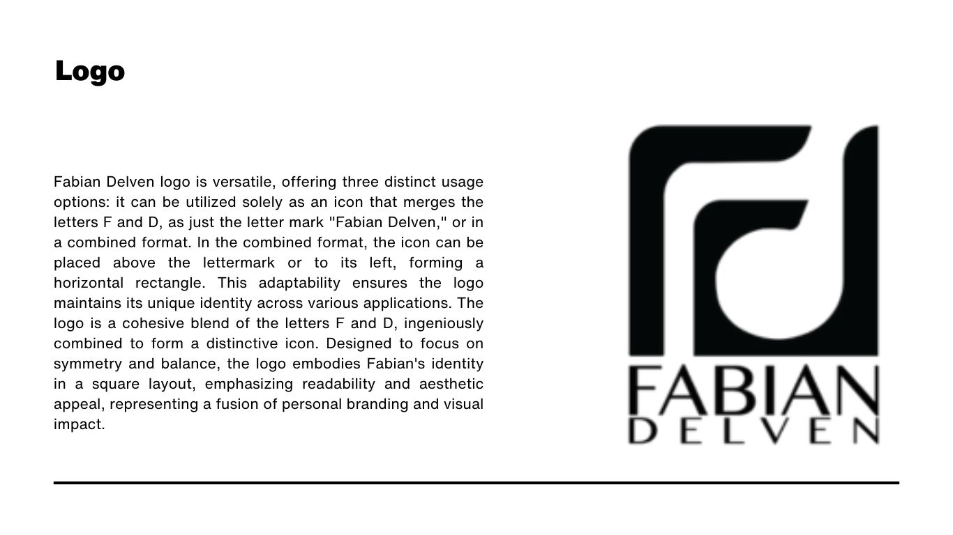
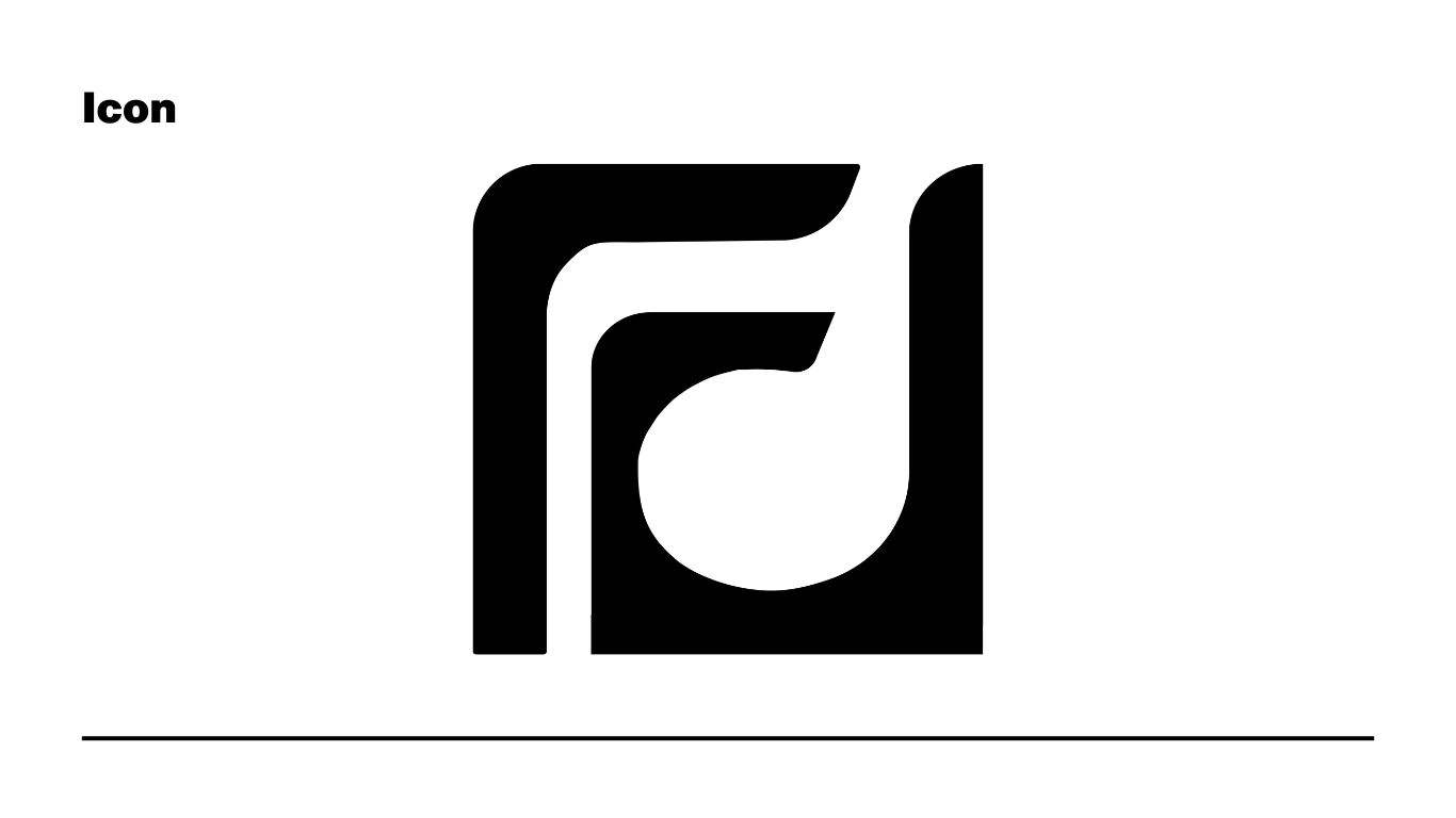
A cohesive blend of the letters F and D, designed for symmetry, balance, readability, and visual impact.
A personal brand system built around creativity, authenticity, precision, collaboration, and respect. The identity combines a bold FD mark, Helvetica Now typography, high-contrast black and white, and a yellow accent for energy and visibility.
The brand story positions Fabian Delven as a brand identity designer who sees beyond the brief: creating visual systems that reflect a brand's true identity, support sustainable practices, and contribute to a larger purpose.
The identity is practical and flexible: the FD icon can stand alone, the wordmark can lead formal applications, and the combined mark can support digital profiles, guidelines, and branded collateral.
A cohesive blend of the letters F and D, designed for symmetry, balance, readability, and visual impact.
A bold standalone mark that can work independently from the wordmark across digital and printed contexts.
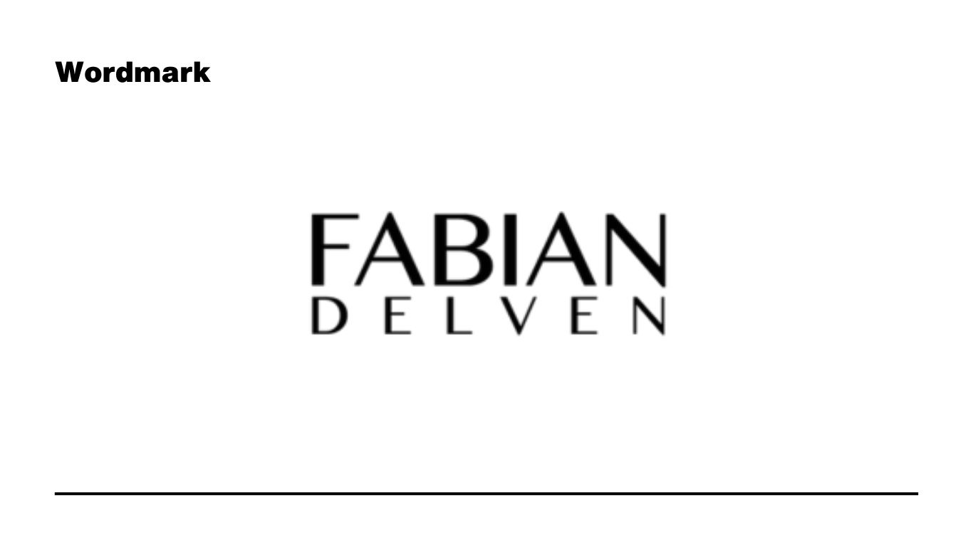
A clean, spacious wordmark that gives the personal brand a professional and recognizable signature.
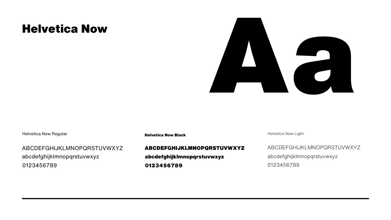
Helvetica Now creates a bold, neutral, and legible voice for headings, body text, and supporting details.
Black anchors the system with sophistication and authority. White creates clarity and breathing room. Yellow adds energy, optimism, and attention for highlights and calls to action.
The voice communicates honesty and transparency while adapting to different audiences and situations. The visual direction pairs structured typography with expressive illustration details for a memorable creative identity.
Crafting brand identities that represent and amplify a brand's story while creating meaningful audience connections.
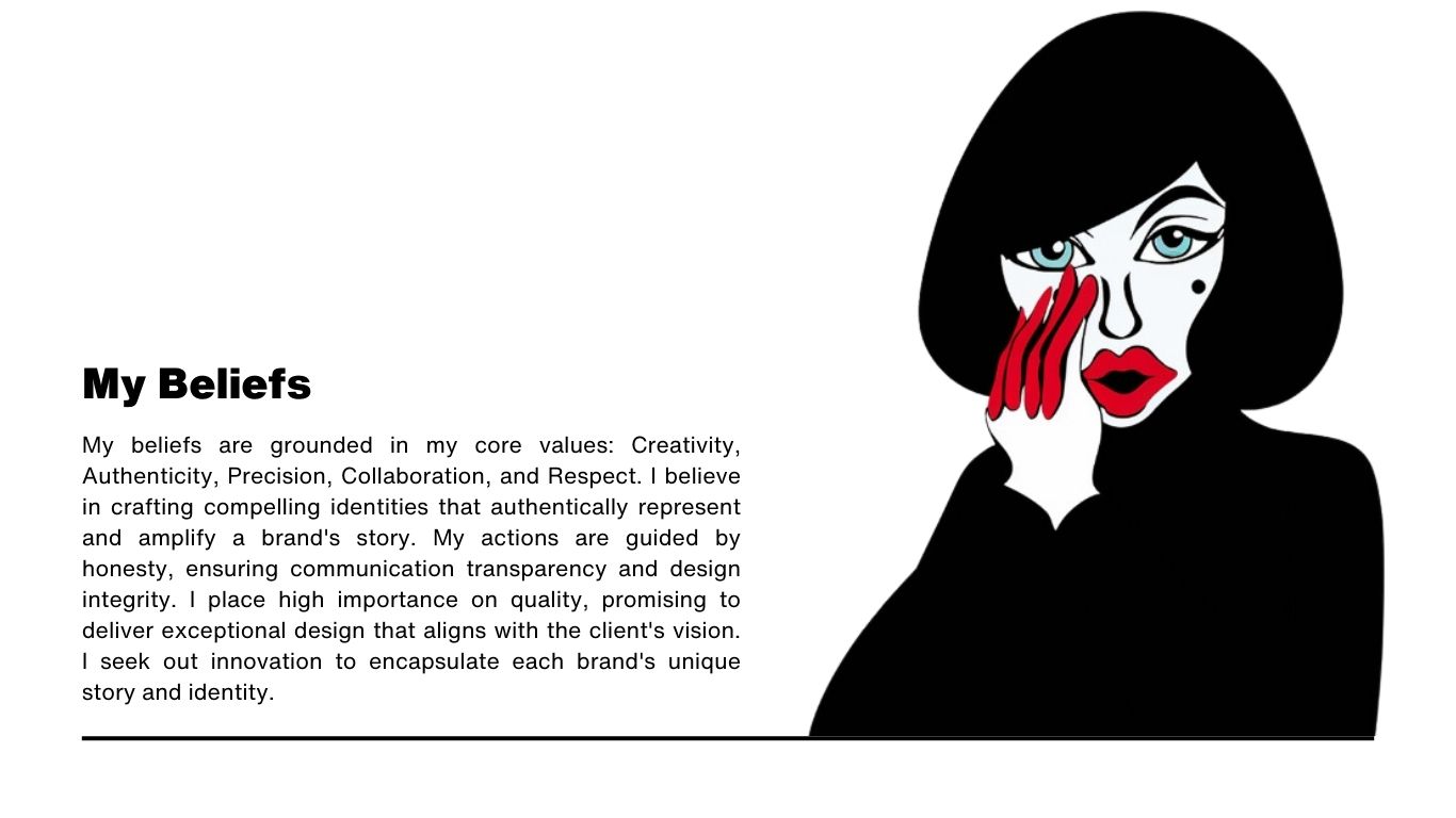
Creativity, authenticity, precision, collaboration, and respect guide the work and the client relationship.
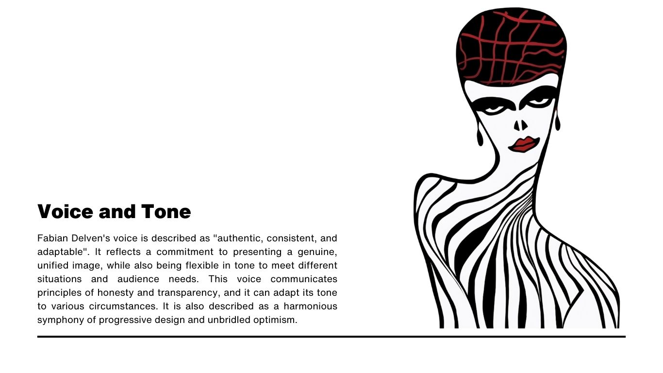
A consistent and adaptable voice that presents a genuine, unified image across different contexts.
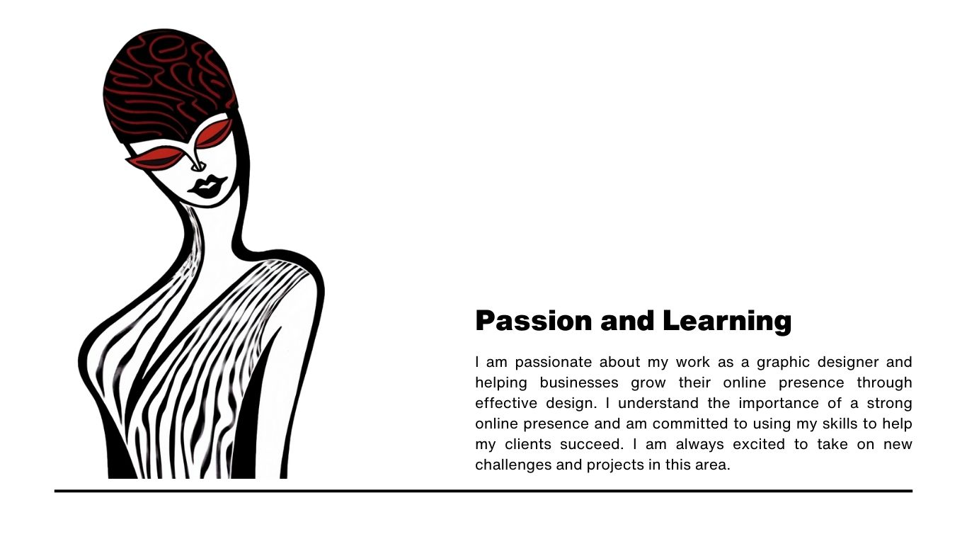
A passion for helping businesses grow through effective design, online presence, and continuous learning.
The guidelines define how the mark should appear and what to avoid: no altered colors, locked-up text, holding shapes, shadows, distorted shapes, or changed relationships between components.
A practical misuse page helps keep the identity recognizable and consistent across applications.