Recognition
Marks, color, type, and composition choices should make the brand easier to identify across every touchpoint.
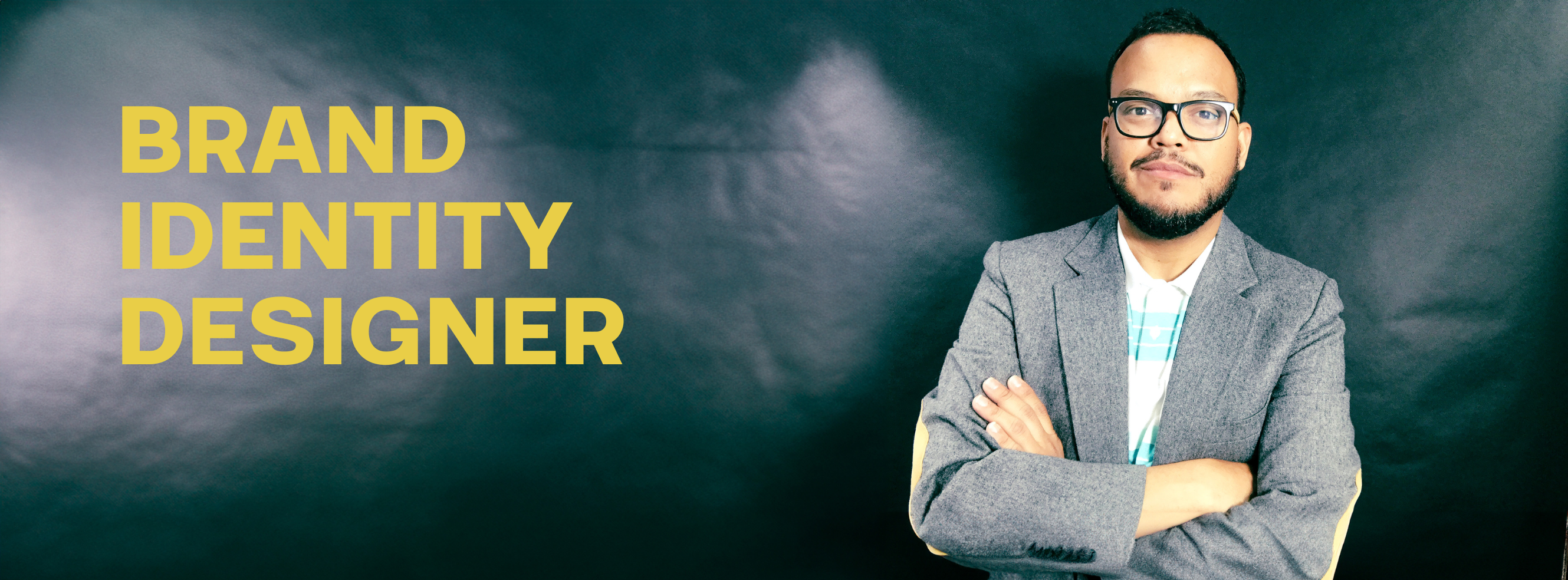
My brand identity work is about giving a business a visual system it can actually use: a clear mark, a recognizable voice, a focused color and type direction, and practical guidelines that help the brand show up consistently across real touchpoints.
Each project below opens into a complete brand identity portfolio. You can see how the system comes together through logos, typography, color, applications, and usage rules instead of viewing the brand as a single static mark.
A personal brand system built around a bold FD mark, Helvetica Now typography, high-contrast black and white, and a confident yellow accent.
A refined identity system for a leather goods brand, including a premium wordmark, monogram icon, typography rules, color specifications, and application mockups.
I think about brand identity as both an expressive layer and an operating layer. The design should create a feeling, but it should also give the business a simple system for making confident visual decisions after the project is delivered.
Marks, color, type, and composition choices should make the brand easier to identify across every touchpoint.
Guidelines turn visual decisions into practical rules so the identity remains clear after launch.
A strong identity shows how it behaves in the real world: social, packaging, business cards, web, and campaign materials.